Variations on a theme, but an improvement from a year ago
In the lead up to the 2024-2025 NBA season, there are plenty of things for the Milwaukee Bucks to mark off their to-do list. Media day, training camp, preseason, and trimming the roster down to its 15 man complement for the year to come. Lower down the list of exciting developments these days we can now regularly include the “reveal” of the team’s alternate uniforms and NBA Cup-specific court.
And, uh, here they are via niche social media accounts!
The Bucks’ NBA Cup court has been LEAKED via the NBA 2K25 files
The home team wore their city jerseys for the IST last year, but if this leak is accurate, the Bucks will wear their statement edition black uniforms… pic.twitter.com/50sWXZw4z4
— TheBucksZone (@TheBucksZone) September 20, 2024

Yay?
Let’s tackle the court first. The black and cream design indicates that the team intends on wearing their “Statement Edition” (I think that’s what they’re called) unis which, for those lost and confused among the muddle of NBA branding in 2024, are the black unis with cream deer antlers up the sides. Aesthetically, the court design is far easier on the eyes than the aggressive mint of a season ago with blue accents. The NBA Cup decal fits in nicely with this color pairing and so should make for a finer viewing experience. My main complaint would be the incongruous choice to use Times New Roman font for FEAR the DEER, but I’ll pin my hopes on this leak being a draft version of the court and not the final product. Nothing says Milwaukee Bucks basketball more than the default font of every Microsoft application sold since the 90s.
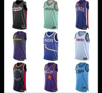
Onto the jersey: Blue is back with all the potential divisiveness that entails. I’ve never been a fan of this direction, but concede that there are plenty of people who like it. The obvious concern here is that the “state outline” portion across the stomach looks a lot like a flatline on an EKG — and we have the audacity to say that poetry is dead. We can safely assume that the shorts that go with the jersey will complete the outline and look more coherent for it. Still, I chuckle thinking of the possible dramatic scenes contrasting a Deer District full of fans wearing these jerseys and whatever product the team musters on the court in the playoffs.
The upside to these City Edition jerseys? No bright neon mint green. That was a serious design mistake and I’m glad the fine overworked folks at Nike skipped it this time around.
Ultimately, I’m the wrong person to write this article. I’m too closely wedded to the red and green of the team’s history to ever embrace the move to blues, mints, blacks, and creams. But you may not be, and I’d be happy to hear your takes on the reveals in the comments below!
Do you love them? Hate them? Overwhelmed with indifference? Sound off below and throughout the season, too. Complaining about branding is a time-honored tradition in sports, and we intend on keeping that ritual alive and well this season.